Adoption dashboard overview
As part of application analytics, the Adoption dashboard provides a comprehensive view of how employees are adopting and engaging with the intranet platform. It highlights overall usage, adoption trends, and participation patterns across the organization, helping stakeholders measure platform success and identify areas for improvement.
Note: All metrics shown on the dashboard for Adoption are always measured.
Key components
Hero metrics: Displays high level metrics capturing a snapshot of the overall App adoption
Total users :
- This metric refers to the Total number of licensed users on the platform as of today for the time filter selected.
- For e.g if the time filter selected, is from Jun 1st 2025- Jun 30th 2025 - the total users displayed on the KPI chart will be the number of licensed users on the platform from Jun 1st to Jun 30th who continue to be on the platform as of today (19th Sep).
- E.g. if the total number of users on the platform between June 1st to June 30th were 48 but between July 1st to today (24th Sep) if the 12 users left the organization, the Total users for the month of June would be 36.
Logged-in users
- This metric refers to the number of “Total users who have logged into the platform at least once”.
- This metric is shown as an absolute number and is measured as a percentage of the “Total users” for the time filter selected.
- In other words this metric is measured against the number of total users on the platform as of today for the time filter selected.
- E.g Logged in Users = 23/36 = 63.9%
- This widget also captures the benchmark of “percentage of logged in users” of similarly sized customers and compares it to the metric of the tenant for comparative analysis.
- This benchmark is only applicable for a time filter selection of 30 days
Contributors and participants
- This metric measures the number of logged in users who are engaging with the platform as either contributors or participants.
- Contributor: Contributors are users who actively create/edit content within the intranet platform. This includes actions like posting updates, writing articles, publishing documents etc.
- Participants: Participants are users who engage with content produced by others. This includes actions such as liking, commenting, reacting, joining discussions, or completing surveys and polls, but not necessarily creating original content themselves.
- This metric is shown as an absolute number and as a percentage of the logged in users
- E.g Contributors and Participants = 16
- Number of logged in users = 23
- % of logged in users who are contributors or participants : 16/23 =69.6%.
- This widget also captures the benchmark of “percentage of contributors and participants” of similarly sized customers and compares it to the metric of the tenant for comparative analysis.
- This benchmark is only applicable for a time filter selection of 30 days only
App adoption rate - User logins
This chart displays the Adoption rate measured as a percentage of total users who logged in to the platform at least once over the selected time period. The adoption rate helps to track platform adoption and monitors platform usage trends over time.
Note:
Detailed data on each metric can be downloaded as a CSV file through the download button on the widget.Features
- X-axis (Reporting date): Shows the login activity over a time period basis the time filter selected
- One can view this data at various levels of granularity of time such as daily, weekly, Monthly, quarterly etc.
- Click on the reporting date on the x-axis and select the appropriate time bucket
- Y-axis (Adoption rate %): Represents the App adoption measured as a percentage of total users who have logged in at least once over the time period selected
- Click on any of the X axis adoption rate label and sort the data in ascending or descending order
Actionables and insights
- Identify spikes or drops in user logins to understand adoption patterns.
- Right click on the spikes or drops to drill down on any attribute such as department and see departments contributing to the spikes or drops in adoption.
- Use the data to evaluate the impact of organizational events, feature releases, or communications on login behavior.
- Support strategies to improve adoption by tracking the effectiveness of interventions.
User engagement breakdown
This chart illustrates user engagement of logged-in users as belonging to one of the categories: Contributors, Participants, and Observers. The pie chart visually displays the proportion and count of users in each category for the selected time frame.
Categories definitions
- Contributors: Logged-in users who actively create and publish content within the platform
- Participants: Logged-in users who engage with content by commenting, liking, reacting, or joining discussions, but do not create original content.
- Observers: Logged-in users who log in and view content but do not interact or contribute.
Insights and data interpretation
- Quickly identify the most common engagement style in your organization.
- Use the breakdown to recognize active contributors, engaged participants, and passive observers.
- Apply insights to design targeted engagement programs and nurture more contributors, or encourage observers to participate.
App web page views
This table provides a ranking of the top 10 app web pages based on total views during the selected time period. Each row represents a specific page and shows the number of unique people who accessed it, the total count of page views, and each page’s percentage contribution to the overall app usage.
Table column descriptions
- Web page: The name or description of the web page tracked within the app.
- Total people: The number of unique users who viewed the page in the selected time period.
- Page view count: The total number of times the page was viewed, including repeat visits by the same user.
- Percentage contribution to total page views: The share of each page’s views compared to the overall app traffic, shown as a percentage.
How to use this chart
- Quickly identify the most and least visited pages in the application.
- Use the ranking to prioritize which pages to enhance, monitor, or optimize for better user engagement.
- Track impact of new features or content areas by monitoring shifts in page view rankings over time.
User login frequency distribution
This chart displays how frequently users have logged in to the platform during the selected time period. Users are grouped into categories based on their number of logins, helping teams to quickly assess overall platform engagement.
Categories explained
- No logins: Users who did not log in at all.
- Formula: Total users on the platform - Number of logged in users
- 1–3 times: Users who logged in between 1 and 3 times.
- 4–7 times: Users who logged in between 4 and 7 times.
- 8–10 times: Users who logged in between 8 and 10 times.
- 10+ times: Users who logged in 10 or more times.
Insights and data interpretation
- Quickly identify groups of infrequent, moderate, and frequent users.
- Drill down to identify which department/location/segment they belong to
- Use login frequency data to target communications or interventions towards users who may need help or encouragement to use the platform.
- Monitor changes in user behavior over time to evaluate the success of adoption or engagement initiatives.
Adoption Leaders by selected “User Parameter”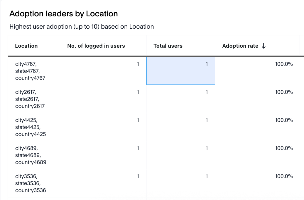
This table identifies the “user parameters”(location/department/segment etc that is available as a drop down option to select at the top filter panel) with the highest user adoption rates (up to 10), based on the percentage of total users who logged in during the selected period. Each row lists a location and the relevant adoption details.
Column descriptions
- User parameter selected: Can be a department/location/segment etc. Available as a drop down option at the top filter panel.
- No. of logged in users: The number of users from the selected “user parameter” who have logged in.
- Total users: The total users on the platform at this selected “user parameter”(location/department etc.).
- Adoption rate: The percentage of users on the platform at this selected user parameter (i.e; location/department) etc who have logged in at least once (shown as a percentage of the total users of that selected “user parameter”).
Adoption laggards by selected “User Parameter”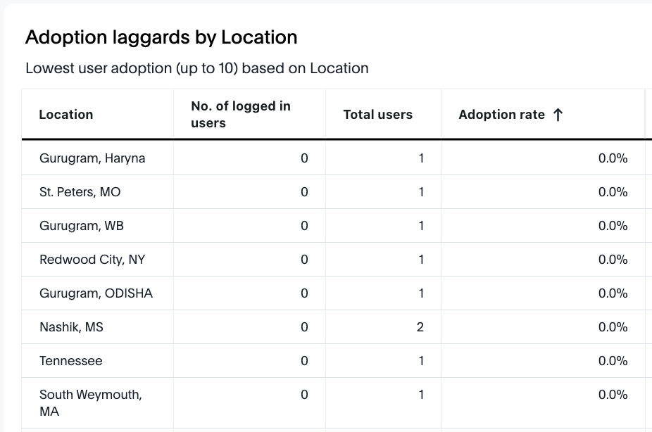
This table identifies the “user parameters” (location/department/segment etc that is available as a drop down option to select at the top filter panel) with the lowest user adoption rates (up to 10), based on the percentage of total users who logged in during the selected period. Each row lists a location and the relevant adoption details.
Column descriptions
- User parameter selected: Can be a department/location/segment etc. as a drop down option at the top filter panel.
- No. of logged in users: The number of users from the selected “user parameter” who have logged in.
- Total users: The total registered users on the platform at this selected “user parameter”.
- Adoption rate: The percentage of users on the platform at this selected user parameter (i.e; location, department etc)location who have logged in at least once (shown as a percentage of the total users of that selected “user parameter”).
Comments
Please sign in to leave a comment.